Introduction
Icons are a fundamental element of any app, as they can provide a simple and effective way to communicate information and enhance the visual appeal of the interface.
Icons can be used to replace or supplement text, making it easier for users to understand the meaning and purpose of different elements in the app. They can also be used to create a visual hierarchy, with more important elements represented by larger or more detailed icons.
Icons can also be used to add visual interest to the interface, and to create a more engaging and aesthetically pleasing design. They can be used to create a sense of movement and animation, which can help to break up large blocks of text and prevent pages from looking too static or boring.
Icons used in templates
The icons used in the templates come from the Material Icons. They are available in 5 styles: Filled, Outlined, Rounded, Two-Tone, Sharp.
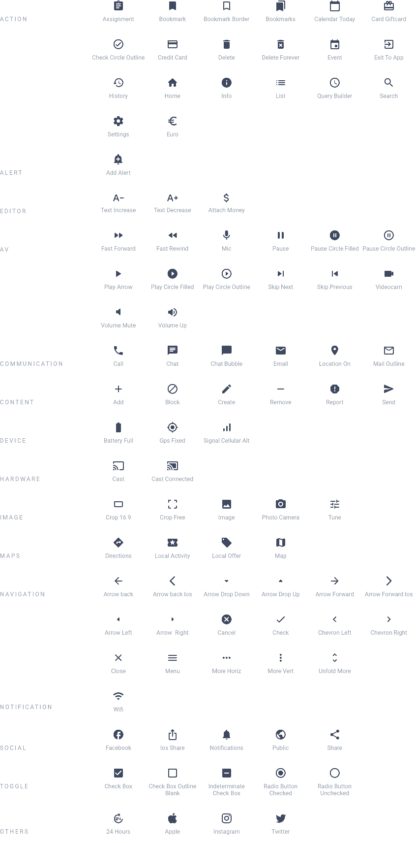
Finding the icons
Material Icon
Browsing and downloading individual icons
GitHub repository
Icons available in the public Git repo

Download full archive
Grab the latest zip archive of all icons or the bleeding-edge version from master.
In addition, this community site offers an alternative way to find specific icons as these 3 examples:

Material design Icons
Icons from the community
Icon creation
Some icons that are not included in the Material Icons pack had to be created, either from existing icons or from scratch.
Creating from existing icons
Using graphic design software, existing icons from the Material Icons pack can be combined:

Creating icons from scratch
As a last resort, if an icon has to be created from scratch, it is recommended to follow some rules for optimal reading. These design principles should be followed.
"System icons are designed to be simple, modern, friendly, and sometimes quirky. Each icon is reduced to its minimal form, expressing essential characteristics."

System icons
Design principles
Uses
In the buttons
The vast majority of buttons use 24 * 24px icons, however there are some exceptions.

- Buttons
- Simple action buttons (most common)
- Action buttons
- Floating buttons
- Menu buttons (example: Browsing Mode LittleSwipeText)
In Headlines, Headers of Detail sections, or as a list item
Here, the icon is more information than a real action button. Its size varies depending on the environment (Headline or list element or devices).
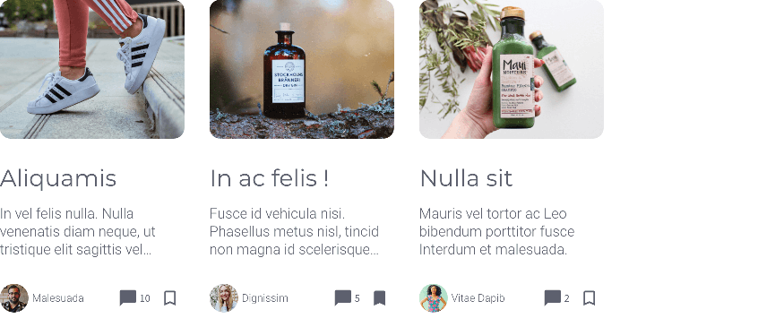
As an image
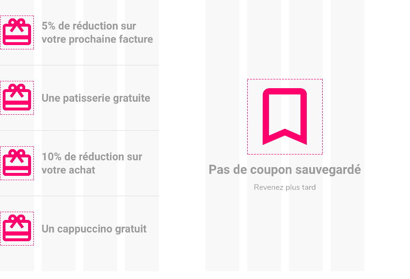
Icons can be used as simple images, within a list or page, for informational purposes or as a nudge to action.
Their size is based on the width of the columns:
 Diseño