Introduction
The Thumbnail component in the GoodBarber design system is a tool for displaying images in a visually engaging and user-friendly way. Its main purpose is to provide a preview of media content and drive the user to view it in full. The Thumbnail component is designed to be both visually appealing and intuitive, making it easy for users to identify and interact with media content.
It can be used in a wide range of contexts, such as displaying images in a gallery or previewing videos in a playlist.
Anatomy
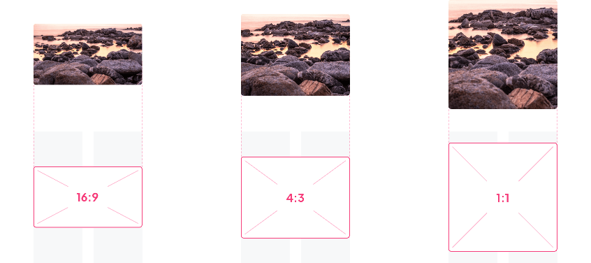
Aspect ratio
Users selected ratios
The user will be able to choose among these 3 predefined ratios for the size of the preview thumbnails:16:9 4:3 1:1

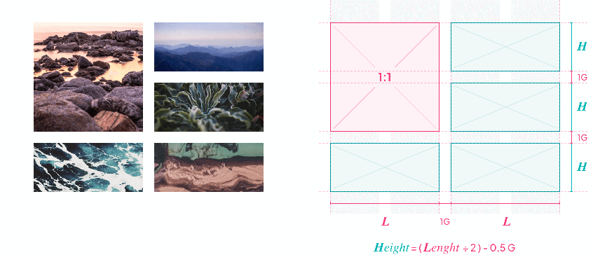
System Aspect Ratio
Sometimes, thumbnail sizes are not influenced by the user's choice as some layouts do not allow this.
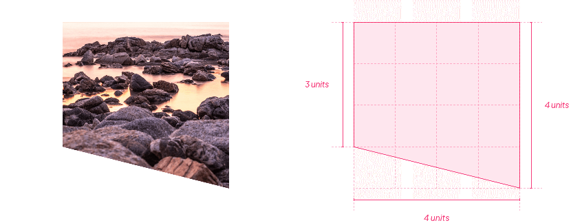
Split thumbnails
In this particular case, the base of the thumbnail is square and we split at the 3rd third.

Some aspects of this component are covered in the section Foundations / Images Aspect Ratio / Thumbnails
Properties
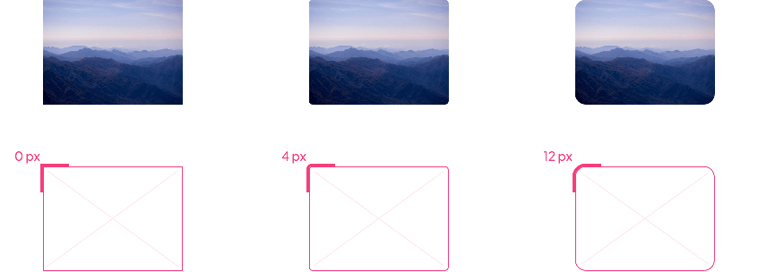
Shape
Below, the Shape atom applied to the button with the types Sharp / Rounded / Round:

Border, Shadow
The Border and Shadow atoms are not applied directly to the component, but to the component in which it is integrated, as in the examples below:

Layout
The appearance of the thumbnail can change depending on the component in which it is integrated:
No Background
In the example below, the list item is visually composed of a thumbnail and a text. The atom shape is applied to the 4 corners of the thumbnail.


Background
In the examples below, the list item is visually composed of a thumbnail, a text and a background. This background can have a color, a border or a shadow and in this case, visually, the atom shape does not seem to apply to the 4 corners of the thumbnail.


 Diseño