Introduction
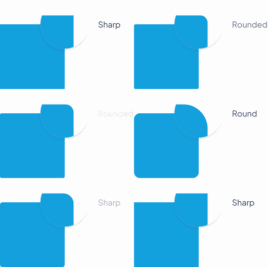
The shape can be set to one of the preset types: Sharp, Rounded, or Round. The preset types allow for quick and easy styling, but it is also possible to customize the radius to create more unique shapes.
This feature allows for consistency in the design of the app, as all GoodBarber components can be set to the same shape. This can be managed globally through the backoffice, with the global shape management , making it easy for designers and developers to ensure a cohesive look and feel throughout the app.

JSON
Here’s the JSON format of this object :
{
"type": { "sharp", "rounded", "round", "custom" }, // Default value "rounded"
"radius": INTEGER, // Used only in case of "custom" shape
}
Documentation
Radius values
These parameters are valid for all devices:
| Sharp | Radius level 0 | ▸ | 0 px | |||||||
| Rounded | Radius level 1 | ▸ | 4 px | |||||||
| Round | Radius level 2 | ▸ | 12 px ou 50% ⚠️ | |||||||
Round Shape Specificities ⚠️
Depending on the component, either a full rounding (i.e. 50% of the total height of the component) or a rounding of 12px will be applied.
There is no real rule and it is the general aspect of the component that takes precedence. This radius is detailed in the section specific to each component.
We can have one of the 3 following cases for a component:
1. Radius of 50% of the total height of the component

2. Radius of 12 px

3. Radius of 50% or 12px depending on the state of the component

Radius distribution
Some components will not receive the Rounded and Round properties on each corner, as can be seen in the examples below.
These values are specified for each component in their respective sections.

 Diseño